
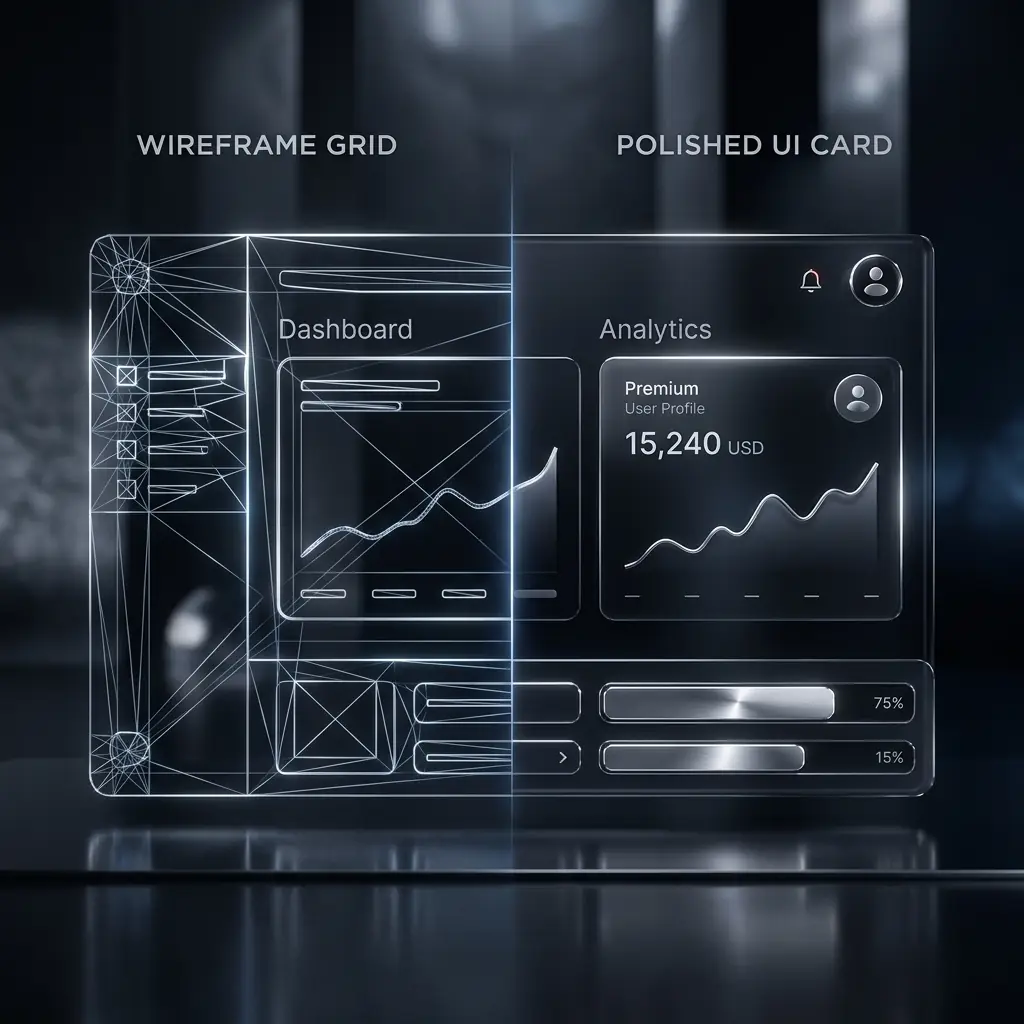
What these six projects had in common
None of these clients needed a prettier site — they needed one that did more work. Every project on this list started from the same diagnosis: real traffic, weak conversion, and a design that hadn't been touched since launch.
The patterns behind the results
Across all six, the same handful of changes did most of the heavy lifting:
- Cutting the homepage down to one clear message
- Rebuilding the path from landing page to contact/checkout
- Replacing generic stock imagery with real product or work
- Fixing load speed on mobile specifically
What you can take from this
You don't need six figures of traffic to see this kind of lift — you need a site built around the one action you actually want visitors to take, and nothing distracting from it.